Website design
Lumière Élégance
Lumière Élégance Travel Space is a fictional college UI design project created to explore interactive components, visual consistency, and intuitive user experiences.
The project brief required the design of three key pages:
-
A Home page, ordering page, and an additional page of choice.
-
The interface included a reusable navigation component with active-page variants.
-
An interactive hero carousel, and a dynamic ordering experience where users could customize product options and see the preview update based on their selections.
PROJECT ROLE
UI UX designer

Challenge
One of the biggest challenges in this project was designing the gift card overlay. The goal was to create an intuitive and visually engaging experience that allowed users to easily view, select, and purchase a gift card without disrupting their journey through the website.
Solution
I designed a clean and intuitive gift card overlay that keeps users within the same shopping experience while making the purchasing process simple and straightforward. The layout clearly organizes the gift card options and important information.
Design
Typography
Colour
Avenir LT Pro Black 72
Headline 1
Avenir LT Pro Heavy 49
Headline 2
#306588
#0A202F
#6BC1AF
Open Sans Bold 22
Body Title
Open Sans Regular 22
Body
#E9F6FE
#D4E4EE
Components
Right from the start, we established a design system in Figma to maintain consistency across the website. Using reusable components, styles, and a consistent naming structure allowed us to apply changes efficiently throughout the design process while keeping the overall visual experience cohesive.
Buttons

Navigation Bar

Footer


Selectors & Counters
Overlay Gift card


Shopping cart overlay
Approach
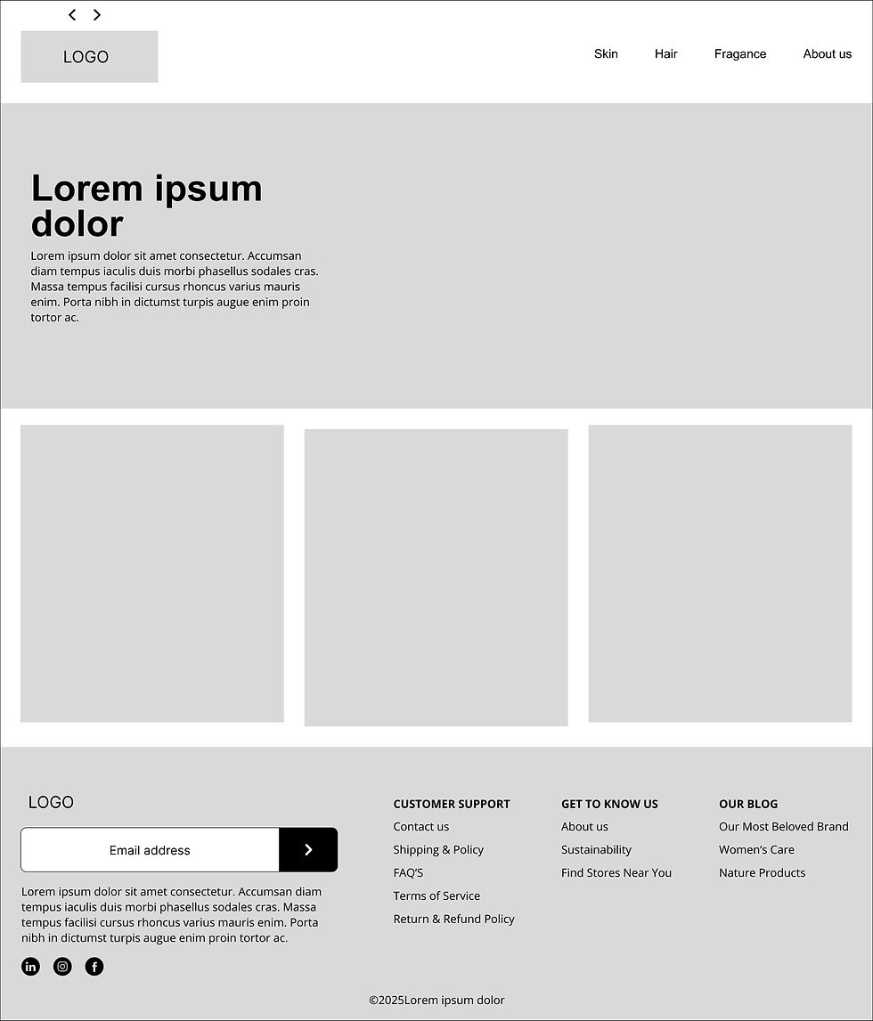
Next step create wireframes were created to test and agree on general directions and to clarify content blocks and fix the structure of the website.



Result
The desktop design uses the larger screen space to create a clear visual hierarchy and structured layout. Content was organized into distinct sections with generous spacing, consistent alignment, and prominent calls to action to make navigation effortless.
For the gift card experience, the overlay was designed to appear without taking users away from the main page, keeping the purchasing journey focused and uninterrupted. Its size, positioning,


